Transform your space with the wonderful world of color
Color and styling tips from colorist Lee Perrault of Via Design in Rye, NH
To learn about the uses of color in creating a home, New Hampshire Home turned to Lee Perrault, a colorist, design consultant and fine artist who owns Via Design—which is now in its twenty-sixth year—in Rye.
New Hampshire Home: To jump right in, what is it about color? On the surface, blue is blue. White is white. But obviously there’s much more to it. What lies below the surface?
Lee Perrault: Color is so special. It influences everything around us, and we respond in an emotional and primal way. That’s what makes choosing colors so complex. We have our emotional expectations, but when someone goes to actually choose a color in a paint store, it’s overwhelming. There are so many brands, finishes and colors. Even for something that seems as basic as beige, there are red, yellow and lavender beiges—it can just go on and on.
NHH: I think everyone’s stood in the paint section, wondering how to choose between colors like “touch of gray” vs. “winter gray” vs. “heaven.”
LP: It’s hard being in a store and choosing a color. Josef Albers, a real color master, says, “Every color is directly affected by the color or lack of color that is next to it or surrounding it.” That means our perception of a color is affected by whatever else we’re seeing at the time: the other color swatches in the store, people’s clothing, anything. Color is a chameleon. And I encourage clients to manipulate color before it manipulates them.
For my clients, we bring home the sample color and set up a little vignette area with the furniture, the throw pillows, artwork, etc. Then, we make a tunnel with our hands and look at it all together. Do this several times a day with different natural lighting and then in the evening with the room lights on.
These are the tricks I bring to help craft a vision and make sure all parts complement each other.
NHH: What do you mean “craft a vision”?
LP: This is where the design aspect of my job comes in. Color isn’t just paint—it’s part of everything: wood floors, cabinets, stone, tile and furnishings, new or existing. Creating a design means all these decisions overlap. For example, say a homeowner loves a particular type of stone for the kitchen, but that might not complement or reinforce the tile chosen for two rooms over. Some homeowners don’t see that until the house is complete. Then they ask, “Why did I choose that when this is right over here?” I can envision the palette and tell what’s going to work—or not.
NHH: OK. So, how do you get started?
LP: I start by meeting clients in their home for a quick tour, hopefully, with all family members. There’s a quote I identify with: “The position of the artist is humble.” So, during that time, I ask a lot of questions
and do a lot of listening, then we get to work.
NHH: What are the types of things you’re listening for?
LP: Key to how I work is tapping in to the client’s inner voice—the one that helped them pick out the colors in the clothes they’re wearing and identifies their comfort zones. I also want to know what the main purpose of the room will be and who is likely to use it. For example, if you come home from work upbeat, you may want lively palette. But if you need to come home for downtime, that wouldn’t be the same. Or is the room a space to concentrate or work? Or heal? Or is it a play room? Then all that information goes into a magic stew.
 NHH: What about the house itself? Does that factor in?
LP: Absolutely! I need to consider the natural light coming in and the size of the house. A big house might call for walls and trim with a little stronger hue: if the room is large and light-filled, certain color values might wash out. In this type of house, the trim often needs more pigment just to keep it grounded. In a smaller house, perhaps with less natural light, the same wall color might be too intense, and the trim might need to be more white.
NHH: So, considering the homeowners, the house itself and how it’s oriented, are there any basic guidelines?
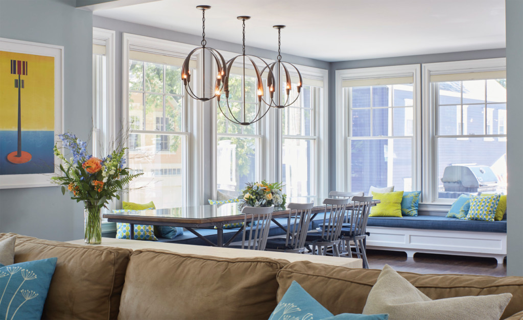
LP: Well, reds and oranges are associated with the south—heat and fire. They stimulate and attract things like energy and appetites. These colors are good for a dining room or eating area. If you’re on a perpetual diet, then it’s not a good combo. Then you’d want something in the purple family, which suppresses appetites.
Greens and blues are associated with the east: relaxing, sleeping, bathing and working. These colors are good for an eastern-facing living room or bedroom. As long as the chosen color is calming—not like a bright, bold lime green.
Whites and yellows are associated with cleanliness, boosting of self-confidence and memory. You’ll see a lot of white and yellow western- or northern-facing kitchens and offices.
That said, yellow is most difficult color for the eye to perceive. It’s the most abused color. People think, “a yellow kitchen will be sunny and happy.” But it can be too intense and overwhelming. I’ve corrected a lot of yellow. And white can easily become stark and cold. Finding the right mix is part of the delicate dance to balancing color.
NHH: It sounds like there’s a color
for anyone and everywhere. Are you seeing any higher demand for “trendier” colors?
LP: I have mixed emotions about concentrating on color trends. Colors that are current always find their way in to homes through the materials and furnishings people purchase. For me, designing with color is about personal colors more than trendy colors.
Honestly, there’s not a color I don’t love when it’s used within the right context. When that happens, it doesn’t matter if it’s in or not.
Pantone Identifies Its Fresh Spring Colors for 2014
Fashion often influences home décor, so it’s important to keep an eye on the forecasts of what will be popular.
Each year, the Pantone Color Institute develops seasonal color palettes. This spring, the company has combined 10 colors to create a palette that reflects, according to Pantone’s website, “a mixture of blooming flowers, travels abroad and strong, confident women.”
“There’s a wonderful sense of balance between the light colors, the pastels, that are very soft and the bright colors that add a lot of energy. In between, you have some neutrals that are a great bridge between those two areas of color,” says Leatrice Eiseman, executive director of the Pantone Color Institute. “They mix very well and at the same time stand well on their own. It’s a very creative palette.”
For more than twenty years, Pantone, which is described as the global authority on color, has surveyed the designers of New York Fashion Week and beyond to identify the season’s most important color trends. Learn more at pantone.com.